The new NBA uniforms have been unveiled for the 2008-09 season.
My reviews: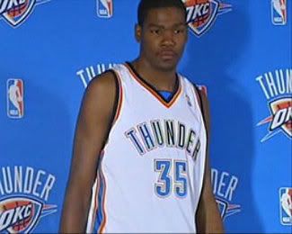
and...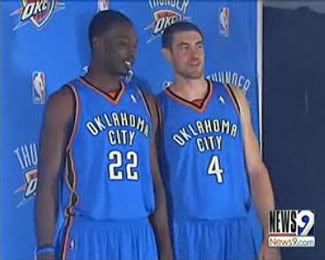
The Oklahoma City Thunder: Sheesh. I'm going to try to be as unbiased as I can being from Texas and being classically conditioned to hate all things Okie...but wow. Seattle fans can at least smirk over this. The Seattle Sonics uniforms were classic looking, and a great color scheme. These things couldn't be more flamboyant if Richard Simmons and Clay Aiken were jumping on a trampoline together while listening to Donna Summer. They look like Golden State and the New York Knicks decided to come together, except the Thunder will play worse than either. The colors are so horrible, I cannot even bear to see the future alternate. Avert your eyes, these aren't even worth grading.
Next up...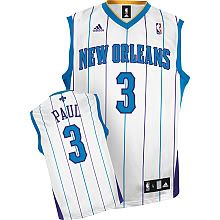
and...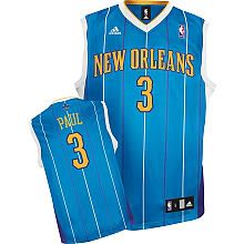
The New Orleans Hornets: Well I'm sure the die-hard Hornet fans (if there are any left) in Charlotte can appreciate this. When I first saw the uniforms, I expected to see Bobby Phills modeling one; of course, in my amazement at the resemblance between the two unis, I forgot that Bobby Phills was dead. You know what else is dead? The brain cells of the person/people who came up with this. The only thing different is the French-styled block lettering on the jerseys. A big F for unoriginality on this one.
Who's next?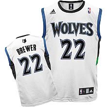
and...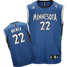
The Minnesota Timberwolves: Meh. I debated even covering this, because outside of the Twin Cities, who cares? The lettering looks cartoony, but their colors are a better fit than the Thunder. I'd give them a C.
Alright...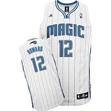
and...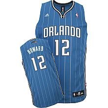
Orlando Magic's 20th Anniversary Uniforms: They call it the "evolution" of their first uniforms, except less hideous with no starry basketball on the front of the jersey. I concur. It isn't my favorite of the crop, but at least they masked the retread of the past with a clever "Anniversary" title. Speaking of retreading the past, their retread looks alot like the retread of New Orleans/Former Charlotte's jersey design. So two present-days have to copy from the same team's past. Interesting. I give it a C. It would be lower, but I respect the BS card they pulled with calling it an "Anniversary" jersey.
Let's move to the Alternates...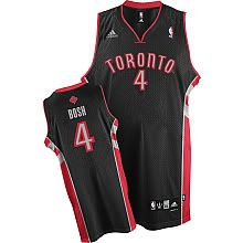
Toronto Raptors Alternate: Now this one I like. I just like red and black together, and the majority black with the red/grey piping looks sweet. The maple leaf is a nice touch. I'd give it an A-.
Looks good. Don't dissapoint me...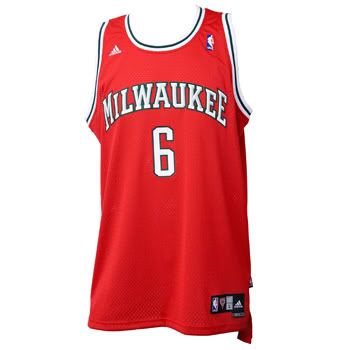
Aww...You did.
Milwaukee Bucks Alternate: WTF. I love the old school style jerseys more than the newer style ones (I hate my beloved Mavs "alternate" designed by P Diddy, that man needs to stick with crappy music, selling hamburgers with trans-fat and creating crappy reality television shows) but this one just sucks. If they trade for Eddy Curry, misshapen as he is, the Bucks will look like they have a Heinz ketchup bottle manning the post. Which would be great advertising if the Bucks were ever to move to Pittsburgh.
I believe that is all of them.
Now what does this have to do with the Grizz, you ask??
It seems that every two years, teams change their uniforms. (Orlando comes to mind.) I guess we're due for a new uniform face-lift any day now. Several people I have spoken to love our away uniforms, but say our home uniforms are a bit plain. Be that as it may, I am fine with our regular uniforms. My question is this:
If every other team can change uniforms and have new alternates every year, where is ours?
Seriously. Where is ours? I think we deserve it. We have/had Spanish night when Pau and Navarro were here, as I am sure we will continue to have it for Marc. Why not throwback night(s)? Hell, I don't even think we should neccesarily create a new uniform for us. Our throwback should be something ABA-styled, or classic NBA styled. Enough with these new jerseys...more of them turn out horrible instead of classic looking. I for one wouldn't be caught dead in any of the re-do's this season. Let's bring back a piece of history.
Presenting your Memphis Grizzlies Throwback/Alternate Jersey: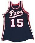
Hak, this is for you.
I know we have "Pro's night" or "Throwback Night" or wait...that horrible "70's night" where we get to wear the cool jerseys but its masked behind horrible music and cheesy costumes. That's fun and all, but I say we use these as our throwback/alternates. They are cooler than the Golden State's "The City" jerseys, another alternate used that doesnt have their current team name plastered on the front. We should be able to use them, and we sure should.
I mean, this:
looks better to me then having the alternate come out urine yellow with blue and white trim, making Stevie Wonder need stronger sunglasses.
I think we should be able to have an alternate if every other team can have one and change their uniforms seemingly every season. However, let's not create a new one and risk it being Thunder-esque horrible. Let's go with what works.
Love the team or not, they ARE the only Pros in Memphis.
Monday, October 6, 2008
Jersey Love
Labels:
ABA,
Alternate Jerseys,
Hakim Warrick,
Memphis Grizzlies,
Memphis Pros,
Throwback
Subscribe to:
Post Comments (Atom)


3 comments:
I've always felt that the Grizz should gain a road alternative using the lighter blue similar to the jazz' alternates or a yellow similar to the pacer's alternates. Come on you know you're just dying to see how OJ rocks thats look.
I have to admit that New Orleans design is quite similar to Baseball Jersey. But the important thing isn't how it looks it is the they can win with it and help me for
Pay per head software
Hey, nice site you have shared here, Great post and informative blog. it was awesome to read, thanks for sharing.
Pay per head sports bookie software
Post a Comment